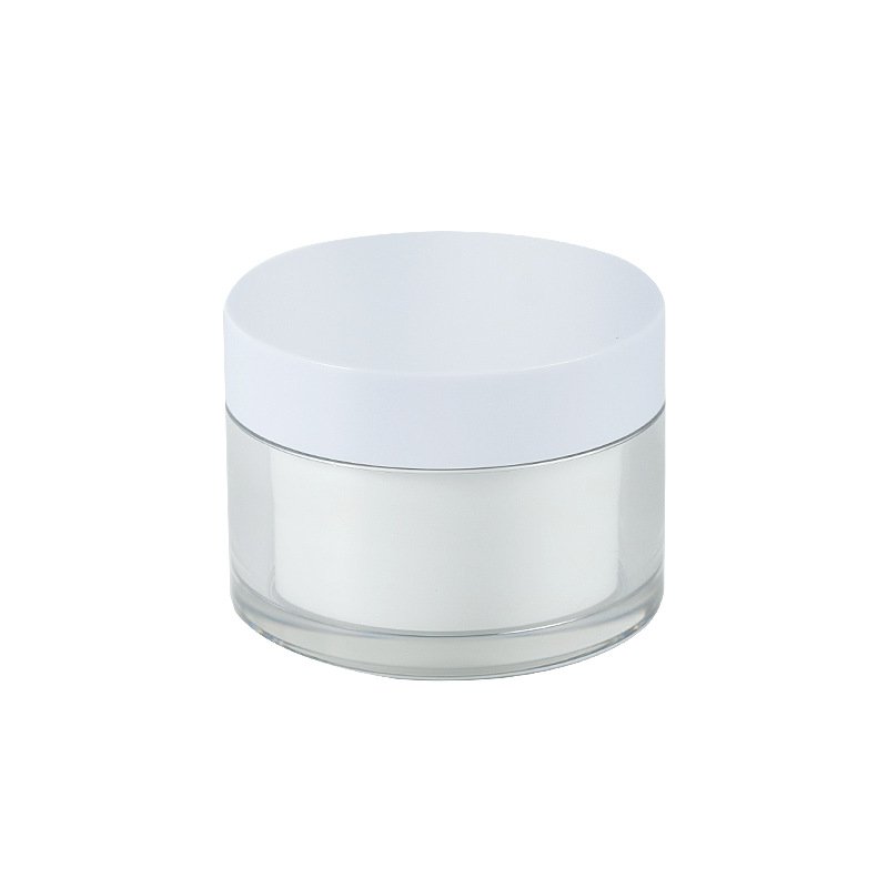

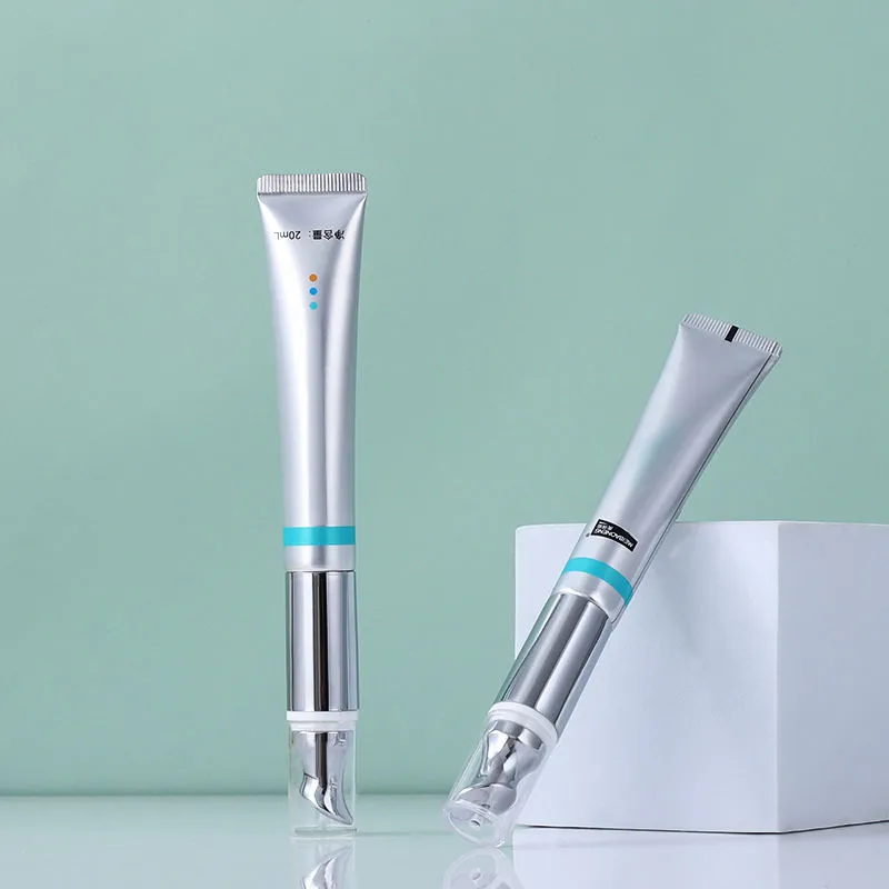
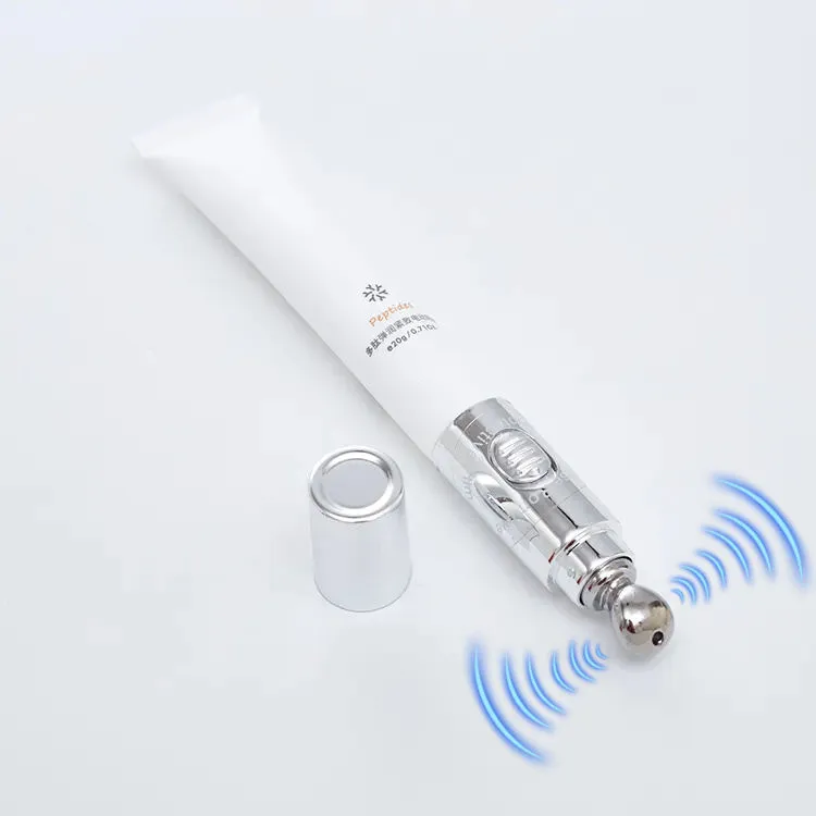
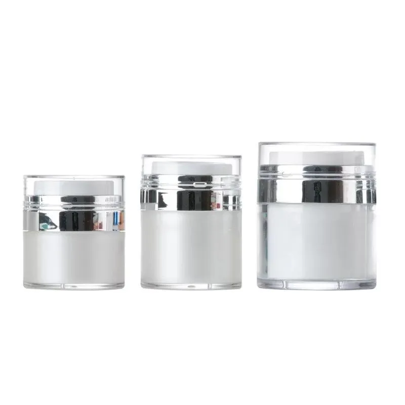
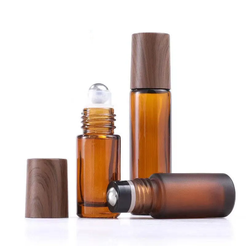
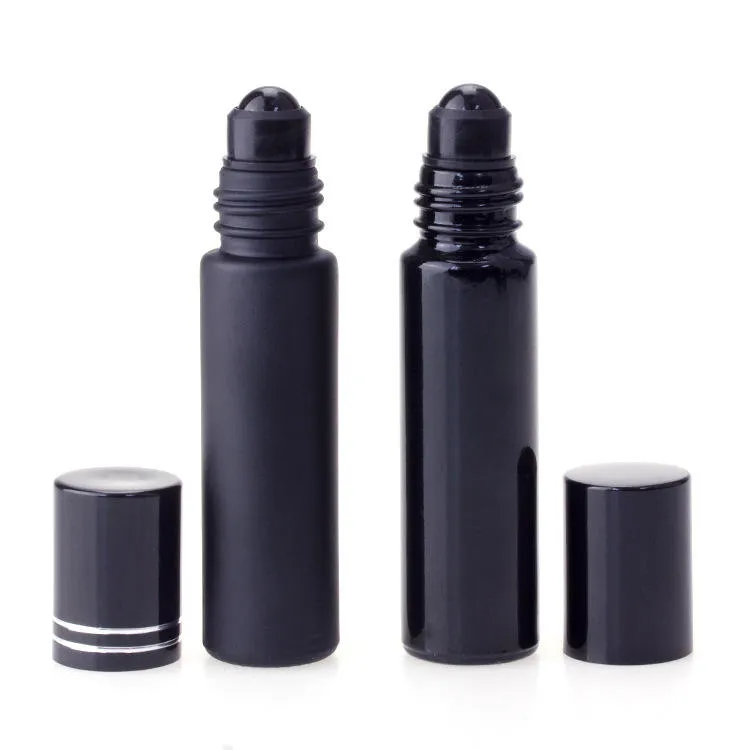
Direct answer: choose screen printing when you want a durable, direct-to-container look with a small number of solid colours; choose hot stamping when a controlled metallic or pigmented foil accent is central to the premium effect; choose a pressure-sensitive label when you need full-colour graphics, dense regulatory copy, several SKUs or economical short runs. None is universally “best.” The correct process is the one that can be manufactured on the actual material and shape, survives the filled product’s use environment, meets artwork and legal-copy needs, and delivers the lowest cost per accepted pack.
Practical default: use direct screen print for the permanent brand mark, hot foil only where metallic impact earns its cost, and a label for variable or information-heavy copy. A hybrid is often more robust than forcing one process to do everything.
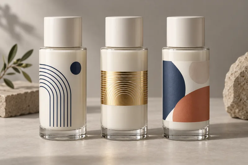
Screen printing vs hot stamping vs labels: quick comparison
| Decision factor | Screen printing | Hot stamping | Pressure-sensitive label |
|---|---|---|---|
| Best use | Permanent logo and solid spot colours | Metallic highlight, border or premium emblem | Full colour, fine copy, versions and short runs |
| Look and feel | Ink sits directly on the pack; “no-label” appearance | High reflectivity or special foil effect | Visible label, or near no-label look with clear film |
| Colour/artwork | Usually one screen and pass per colour; registration matters | Best as a controlled accent; fine detail depends on die, foil and surface | CMYK, photographs, gradients, white ink, variable data and small type |
| Shape tolerance | Good on controlled cylindrical, oval or flat print areas with correct tooling | Most sensitive to contact, levelness and curvature | Good on label panels; taper and compound curves need engineered constructions |
| Short-run economics | Setup and per-colour passes can dominate | Die, setup and foil-change cost can dominate | Often strongest, especially with digital label printing |
| Long-run economics | Can be attractive for stable, repeat artwork | Efficient for a limited, repeatable accent | Includes facestock, adhesive, liner and application at every unit |
| Main failure risk | Ink adhesion/cure, smearing, registration | Incomplete transfer, wrinkling, heat distortion, die marks | Edge lift, bubbles, flagging, scuffing or label skew |
| Best reason to choose it | The ink should look integral to the container | The foil effect creates real shelf value | Information density or SKU flexibility is the constraint |
What are screen printing, hot stamping and labels?
Screen printing: ink is deposited directly through a stencil
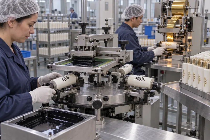
A screen carries a stencil of the artwork. A squeegee pushes ink through the open mesh onto the package while the bottle is held and, for a cylindrical print, rotated in a controlled relationship to the screen. The ink is then cured or dried according to its chemistry. Each spot colour normally needs its own screen, ink and pass. Screen printing is valued for opaque colour, a direct-on-pack appearance and good durability when the substrate, pretreatment, ink and cure are properly matched.
The word silk survives in “silk-screen printing,” although modern industrial screens commonly use synthetic mesh. If you need the detailed process, glass-versus-plastic differences, workshop conditions and ink-adhesion controls, see Boyu’s guide to silk-screen printing on bottles. This article deliberately focuses on choosing between methods rather than duplicating that technical guide.
Hot stamping: a die transfers selected foil layers with heat and pressure
In hot stamping, a heated die presses a foil construction against the package. At the correct temperature, pressure and dwell time, the release and adhesive layers allow the decorative coating to leave its carrier only where the die makes effective contact. “Foil” is not necessarily a thick metal sheet; it is a thin engineered transfer system that may deliver metallic, pigmented, holographic or other effects.
On bare or coated glass, a qualified route may first screen-print a primer image and then transfer the foil to that primer. On plastics, resin, coating, surface treatment, heat resistance, part geometry, die hardness and support tooling all matter. A foil that works on ABS cap stock may not work on untreated PP or on the curved shoulder of a PETG bottle.
Pressure-sensitive labels: a preprinted construction is bonded to the pack
A pressure-sensitive label is a laminated construction: printable facestock, optional print/varnish/laminate, adhesive and a release liner. The converter prints and die-cuts the label; the brand, filler or packaging supplier applies it with controlled wipe-down pressure. The adhesive then builds contact with the surface. Paper, PP, PE and PET films behave differently, as do permanent, removable, wet-application, freezer and wash-off adhesives.
This comparison addresses self-adhesive labels. Shrink sleeves, in-mould labels and wet-glue paper labels are different systems with different machinery, economics and recycling implications.
Which method fits glass, PET, PETG, PE, PP and tubes?
Material names are a starting point, not an approval. Colour masterbatch, recycled content, mould release, slip additives, surface coating, frosting, metallisation and storage age can change adhesion. Ask the decorator to identify the exact substrate and treatment, not merely say “plastic ink” or “strong adhesive.”
| Package | Screen printing | Hot stamping | Labels |
|---|---|---|---|
| Glass bottles and jars | Strong premium route with the qualified glass ink, clean surface and specified cure | Possible with a compatible primer/foil system and controlled geometry | Generally label-friendly; coatings, cold/wet surfaces and taper still need validation |
| PET bottles | Common, but ink compatibility and bottle heat sensitivity must be confirmed | Possible on stable zones with the correct foil and thermal window | Often a practical route; avoid condensation and verify recycling design |
| PETG and thick-wall copolyester | Good visual potential; solvent stress and adhesion need testing | Premium effect, but excessive heat/pressure can mark or distort a part | Works on designed label panels; verify appearance on clear walls |
| HDPE/LDPE bottles | Usually needs verified flame/corona treatment and a PE-suitable ink; flex test | Possible on supported, controlled areas; squeeze recovery and heat matter | Use conformable film/adhesive designed for low-energy plastic and squeezing |
| PP bottles, jars and caps | Pretreatment and ink selection are critical because PP is low surface energy | Widely used on caps with the correct foil/treatment; curved walls are harder | Choose an adhesive proven on PP; do not extrapolate from PET tests |
| Cosmetic tubes | Direct screen print can flex when correctly formulated and cured | Effective for limited accents; tube support and seam/orientation matter | Useful for short runs, but squeeze cycling can wrinkle or lift a stiff label |
| Aluminium components | Possible over a qualified lacquer or prepared metal surface | Often attractive, but the foil must remain visually distinct from the base finish | Practical on clean cylindrical surfaces; lacquer and condensation can affect bond |
Shape can eliminate an otherwise suitable process. A straight cylinder offers a predictable print or label path. A recessed panel supports a label. A shoulder, taper, rib, mould parting line or compound curve changes contact pressure and registration. On squeezable plastic cosmetic bottles, flex and panel movement matter; on heavy cosmetic glass packaging, cleanliness, coatings and dimensional consistency dominate.
Choose by artwork and information architecture
Choose screen printing for controlled spot colour and an integrated pack
Screen print is strongest when the identity can be expressed with one to three solid colours, a clean logo and enough line weight to reproduce reliably on the actual diameter. It is less efficient when artwork needs photographs, frequent language changes, numerous ingredients or many small-volume variants. Every added colour creates another screen, setup, cure/pass and registration relationship.
Choose hot stamping when the foil is a deliberate focal point
Hot stamping works best as a disciplined highlight: a logo, line, collar band or emblem on a stable contact area. Large solid foil fields magnify surface waviness, pinholes and pressure variation. Very fine reversed details can fill in; unsupported shoulders can lose contact. Approve the actual gloss, hue and reflectivity because “gold” is not one standard colour.
Choose a label when the information changes faster than the bottle
Labels handle process colour, photography, fine regulatory copy, barcodes, multilingual panels, variable data and regional versions well. They also separate bottle inventory from artwork inventory: one undecorated pack may support several low-volume SKUs. Clear film can create a no-label look, but clear adhesive, trapped air, dust and bottle scuffing become more visible.
Decoration never replaces regulatory responsibility. In the United States, required cosmetic information must be prominent and conspicuous. In the EU, Article 19 requires specified information in indelible, easily legible and visible lettering. If the direct-decoration area cannot carry durable mandatory copy, reserve a label, carton, leaflet or other permitted information route after regulatory review.
Which is cheaper? Compare accepted-unit cost, not the decorating quote
Accepted-unit cost = plain component + setup/tooling ÷ accepted units + decoration/material/application + inspection + scrap/rework + inventory/change cost
This formula explains why no honest supplier can name the cheapest method from the artwork alone. A low printing price with 8% cosmetic rejects can cost more than a higher process price with stable yield. A label may add material at every unit but avoid screens, dies and finished-bottle inventory across ten SKUs. A direct print may become economical on a stable repeat order because there is no label stock or application step at filling.
| Cost layer | Screen print | Hot stamp | Label |
|---|---|---|---|
| Fixed/setup | Artwork separation, one screen per colour, fixtures, colour matching, line setup | Die, fixture, foil sampling, press setup and process window | Prepress, plates for conventional print or digital setup, cutting die where needed |
| Variable | Ink, each colour pass, curing, handling | Foil consumption, stamping cycle, operator and handling | Facestock, ink/finish, adhesive, liner, conversion and application |
| Hidden risk | Multi-pass reject multiplication and decorated component obsolescence | Surface/geometry rejects and foil shade-lot changes | Application labour/machine, liner waste, roll MOQ and obsolete version stock |
How order quantity changes the answer
- Prototype and market test: digitally printed labels are usually the lowest-risk path because artwork can change without decorating a full component lot.
- Growing brand with several SKUs: one stock bottle plus versioned labels often beats separate printed-bottle inventory. A screen-printed front logo plus a variable back label is a useful hybrid.
- Stable repeat volume: screen print can deliver strong value when the same substrate, colours and artwork repeat with good yield.
- Premium hero SKU: hot foil can be justified where the shelf effect supports the target price. Apply it selectively rather than assuming more foil means more premium.
MOQ may be controlled by the bottle colour, ink batch, foil roll, label material, printing method or application line—not just the total number of packages. Ask the quotation to separate each MOQ and state whether overruns, underruns and decoration rejects are included.
How to test decoration durability before mass production
There is no single universal “cosmetic decoration test” that proves every end use. Build a validation plan from the likely failure mechanisms and define the method, conditioning, sample count and acceptance criteria before testing. A useful sequence is:
- Lock the production-intent build. Record resin/glass, colour, recycled-content level, coating or frosting, treatment, ink and hardener, cure, foil/primer, label construction, adhesive, application equipment and date codes.
- Condition and apply correctly. Bring parts and labels to the defined application environment; keep surfaces dry and clean; use production fixtures, pressures and speeds. Label adhesive performance immediately after application is not the same as after dwell.
- Establish a visual baseline. Approve colour under defined light, position, print/foil coverage, label skew, bubbles, wrinkles and acceptable cosmetic limits.
- Challenge adhesion and wear. Use a documented tape or cross-cut comparison where appropriate, controlled dry/wet rub, abrasion and handling tests. ASTM D3359 is primarily a coating comparison method with limitations; do not turn it into an arbitrary universal rule for flexible plastics.
- Challenge the actual use environment. Expose samples to the filled formula and plausible contaminants such as oil, alcohol, surfactant, sunscreen, water and cleaning residues. Add hot/cold conditioning, high humidity, bathroom use, squeeze/flex cycles or fragrance contact according to the pack.
- Test the line and distribution system. Run filling, capping, conveying, coding, packing and shipment simulation. Decoration that passes a laboratory rub may scuff against guide rails or partitions.
- Retain samples and trend production. Keep signed limits and samples from the approved trial and first mass-production lot. Revalidate after a substrate, treatment, ink, foil, adhesive, coating, supplier or process change.
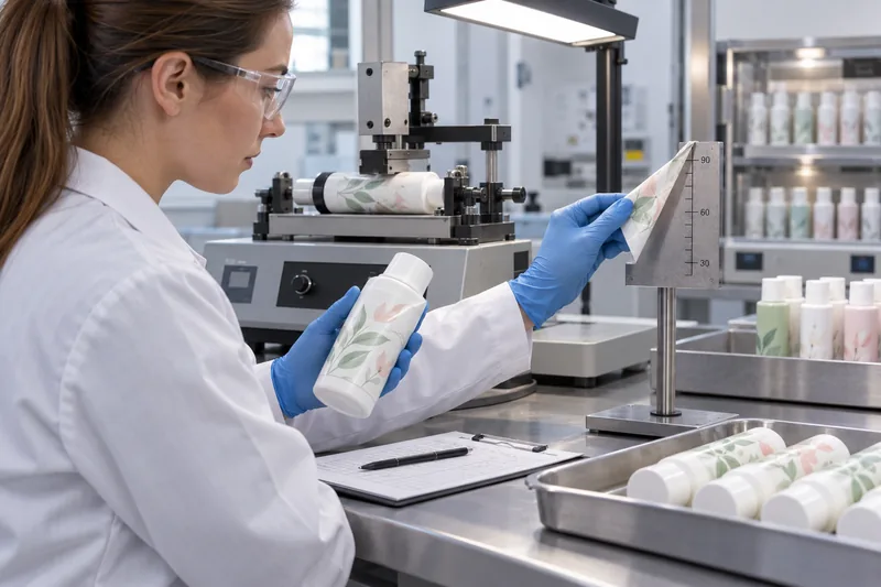
For a broader plan covering dimensions, leakage, drop, dispensing, compatibility and transport—not decoration alone—use Boyu’s guide to tests required for cosmetic bottles and its detailed cosmetic packaging compatibility test framework.
Common problems, root causes and corrective actions
Screen-printing defects
| Problem | Likely causes | Corrective path |
|---|---|---|
| Ink peels or wipes off | Wrong ink/substrate match, weak or aged treatment, contamination, wrong mix, under-cure or chemical attack | Quarantine the lot; verify resin/coating and surface treatment; audit mix/cure records; re-test with production ink and formula. Reprinting over weak ink is not a durable fix. |
| Blur, smearing or double image | Bottle slip, off-contact/squeegee setting, excessive ink flow, poor fixture or premature handling | Correct fixture and rotation, stabilise viscosity, adjust screen/squeegee, then verify cure and handling interval. |
| Pinholes or missing print | Dust, oil, rough coating, blocked mesh or poor ink transfer | Improve cleaning/air control, inspect incoming surfaces and screen condition, and reset transfer parameters. Define pinhole limits in the signed sample. |
| Colours do not register | Bottle dimensional variation, fixture datum error, screen stretch, orientation drift or part movement | Use a reliable orientation datum, verify part tolerance and fixtures, add artwork trapping where appropriate, and prove registration over a representative run. |
Hot-stamping defects
| Problem | Likely causes | Corrective path |
|---|---|---|
| Incomplete or broken transfer | Low/uneven heat, pressure or dwell; incompatible foil/primer; poor contact; surface variation | Map the process window one factor at a time, check die level and support, verify foil lot/primer/cure, and inspect the unprinted part surface. |
| Fill-in, bridges or fuzzy edges | Excessive heat/pressure/dwell, unsuitable die hardness, detail below process capability | Reduce energy within the qualified window, optimise die, increase artwork spacing/line weight and reapprove the limit sample. |
| Wrinkle, crack or dull patch | Foil tracking/tension, curvature, surface texture, over-stretch or wrong release characteristics | Stabilise feed and contact, reduce foil field/relocate artwork, and select a foil designed for the substrate and geometry. |
| Plastic deforms or shows a die mark | Too much heat/pressure, insufficient internal support, thin wall or an unstable print zone | Stop production, improve mandrel/support, lower process energy or move the artwork. Do not hide structural distortion as a cosmetic concession. |
Pressure-sensitive label defects
| Problem | Likely causes | Corrective path |
|---|---|---|
| Edge lift or flagging | Low-energy plastic, contamination/condensation, high label stiffness, tight radius, insufficient overlap or pressure | Identify resin/coating, keep surface dry, select compatible adhesive and conformable facestock, soften corners, improve wipe-down and confirm dwell before testing. |
| Bubbles, wrinkles or tunnelling | Dust/air, incorrect label geometry, tapered or compound curve, excessive tension, poor application alignment | Redesign the label shape, validate a more conformable film, clean the surface, and tune dispenser, roller pressure and bottle control. |
| Label slides or falls off when wet | Application to a wet/cold surface, wrong adhesive, no dwell, formula migration or prolonged immersion | Apply to a dry conditioned surface, choose adhesive for the real exposure, define dwell and test with filled packages through humidity/water cycles. |
| Ink scuffs or laminate lifts | Insufficient varnish/laminate, poor interlayer bond, aggressive formula or pack-to-pack abrasion | Upgrade protective finish, verify ink/film compatibility and redesign packing contact points; test finished rolls and applied packs. |
A six-gate method for choosing the right decoration
- Mandatory-copy gate: list every required statement, language, barcode and variable item. If it cannot fit legibly in direct decoration, reserve a label or secondary pack.
- Substrate-and-shape gate: identify exact material, coating, treatment, wall/flex behaviour, taper, radius, seam, parting line and usable decoration panel.
- Use-environment gate: map formula contact, consumer handling, shower/bathroom humidity, UV/light, alcohol/oil, squeeze cycles, temperature and expected life.
- Artwork gate: separate permanent brand assets, metallic accents, high-resolution colour, fine copy and variable information. Assign each to the process that does it reliably.
- Commercial gate: compare SKU count, forecast uncertainty, repeat frequency, tool/setup amortisation, finished-goods obsolescence, yield and filling-line application cost.
- Validation/end-of-life gate: confirm the supplier can prove process capability and that decoration, label coverage, adhesive, ink and foil align with the target recycling stream or sustainability claim.

A weighted scorecard for cross-functional approval
Have marketing, regulatory, operations, quality and procurement rate each viable route from 1 (poor) to 5 (strong), then multiply by the agreed weight. A sensible starting allocation is: substrate/geometry feasibility 20%, verified durability 20%, artwork and brand effect 20%, legal copy/versioning 15%, accepted-unit economics 15%, and end-of-life/change control 10%. Change the weights for your programme; do not change pass/fail technical gates into negotiable averages.
Fast recommendations by project type
- Luxury fragrance bottle: screen-printed colour plus a limited hot-foil emblem, validated for alcohol exposure.
- Many-language skincare range: permanent front branding plus a versioned back label.
- Small launch with uncertain forecast: stock bottle and digital pressure-sensitive label.
- Squeezable shampoo or lotion bottle: flexible direct ink or a conformable PE/PP label system, proven through squeeze cycles.
- Minimalist premium jar: one opaque screen colour; add foil only if the geometry gives consistent contact.
When a hybrid decoration is better
A hybrid is not a compromise when each process is assigned to its strongest job. Common architectures include:
- Screen-printed front + labelled back: permanent brand identity with flexible ingredients, claims and language.
- Screen print + hot foil: opaque colour and a metallic accent without foiling a large unstable field.
- Decorated label: metallic foil or embossing is produced on the label in a flat web process, then applied to a bottle that would be difficult to stamp directly.
- Direct print + variable over-label: a standard pack is held in inventory; limited editions or market-specific information are added later.
Hybrid systems add a tolerance stack. Specify the relationship between the bottle seam, print datum, foil position and label edge. Confirm that later heat, solvent, wiping or label application does not damage the earlier decoration.
What to put in the RFQ, artwork brief and quality agreement
Component drawing and revision; exact resin/glass/coating; colour and recycled content; neck/closure; decoration panel; filled formula and fill conditions.
Vector file; spot/process colours; Pantone reference plus physical target; white underprint; metallic foil code; print order; readable type; barcode grade need.
Treatment; approved ink/foil/primer/label and adhesive; cure; fixture/datum; print passes; application environment; line and subcontractor identity.
Colour method/tolerance; position and registration; pinhole/void/edge limits; adhesion/rub/peel tests; conditioning; sample size; AQL or agreed sampling plan.
MOQ by component/process/colour; setup and tool ownership; target yield; over/under delivery; reject allowance; lead time; packaging and Incoterm.
No unapproved substitution of substrate, treatment, ink, foil, primer, adhesive, facestock, coating, decorator, cure or tooling; define requalification triggers.
For skincare packaging, include oil, surfactant, sunscreen and bathroom-use challenges as relevant. For perfume packaging, add alcohol/fragrance exposure and cap/contact scuffing. A generic certificate from the ink, foil or label supplier does not replace testing on your filled production pack.
Sustainability and recyclability: avoid blanket claims
The smallest visible decoration is not automatically the best recycling design, and a “recyclable label” is not recyclable on every bottle in every collection system. Direct-print ink, foil layers, label facestock, adhesive, coverage, colour and density can affect sorting and reprocessing. For PET, current APR design guidance considers label construction and surface coverage in sorting tests. For other plastics and export markets, use the relevant local design guide and test protocol.
Good practice is to minimise unnecessary coverage and material variety, avoid unsupported environmental claims, and require evidence for the complete bottle-decoration combination. A vendor statement about a foil or adhesive is useful input, but the brand remains responsible for the finished-package claim.
Frequently asked questions
Is screen printing more durable than a label?
Not automatically. A correctly treated and cured ink can be highly durable, but the wrong ink can wipe off. A correctly selected film label can survive water and abrasion, but the wrong adhesive can lift. Compare the qualified production systems under the same formula, handling and environmental tests.
Can hot stamping be applied directly to glass?
It can be achieved with a compatible system, but many glass routes first create a screen-printed primer image and transfer foil to it. Bare glass, painted glass and different coatings may require different pretreatment and cure. Qualify the exact glass and decoration stack.
Which process is best for PP or PE bottles?
There is no material-only answer. Screen print generally needs verified surface treatment and a compatible ink; labels need an adhesive designed for low-surface-energy plastic; hot stamp needs a compatible foil and safe thermal/contact window. Squeezable PE also requires flex testing.
Are labels waterproof?
“Waterproof” is too broad. Film facestock may resist water while paper swells, ink scuffs, an overlaminate lifts or adhesive loses hold on a wet surface. Specify exposure—splash, condensation, shower humidity or immersion—then test the printed label on the filled bottle after defined dwell.
Which method is best for photographic graphics?
A process-colour label is usually the most practical. Direct screen print is normally better for spot colours and simplified artwork. Multicolour direct print is possible, but each pass raises registration, yield and cost risk.
Should a startup choose labels first?
Often yes, especially when forecasts and claims are still changing. But the bottle still needs a label-compatible panel and material, and manual application labour can be costly or inconsistent. Design the pack so the label route can scale to automatic application.
Need to compare the three methods on your actual package?
Send Boyu Packaging the container drawing or sample, exact material/coating, artwork, formula type, target markets, order quantity and use environment. We can help define feasible decoration zones, sampling, test items and a quotation that separates setup, unit decoration and packaging costs.
Request a decoration feasibility review or browse more technical guidance in Boyu’s Product Knowledge library.
Sources and technical references
- Nazdar — 5100 Series Container Screen Ink.
- Nazdar — 4300 Series UV Container Screen Ink technical data.
- Marabu — Hot Stamping on Glass technical information.
- ITW ShineMark — hot-foil process primer.
- Avery Dennison — PET bottle labeling technical overview.
- FINAT — Technical Handbook and self-adhesive label test methods.
- ASTM D3359 — Measuring Adhesion by Tape Test.
- U.S. FDA — Cosmetics Labeling Regulations.
- EU Regulation (EC) No 1223/2009 on cosmetic products.
- ISO 22715:2006 — Cosmetics — Packaging and labelling.
- Association of Plastic Recyclers — Design guidance for direct printing inks.


 English
 Español de Argentina
 Русский
 Italiano
 日本語
 한국어
 العربية
 Français
 Deutsch