
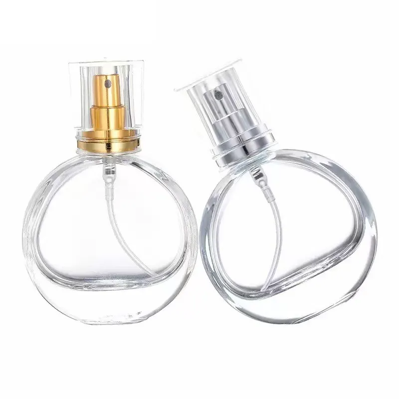
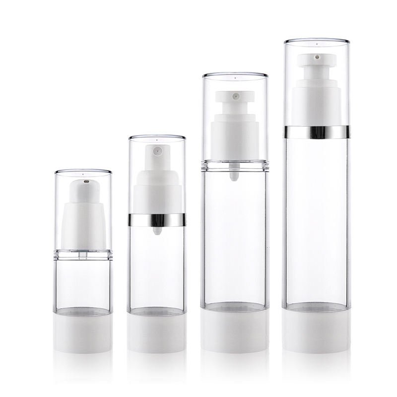
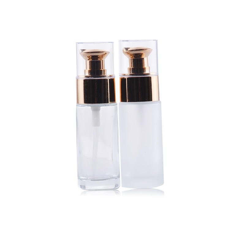
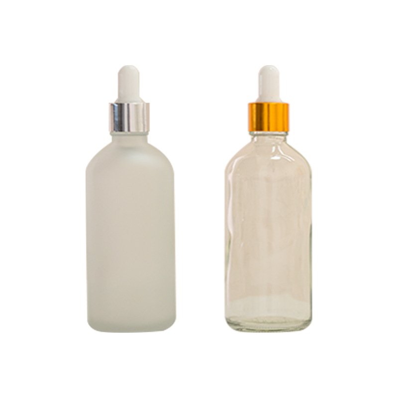
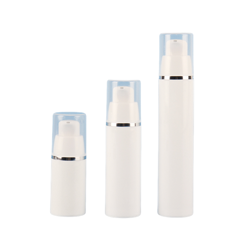
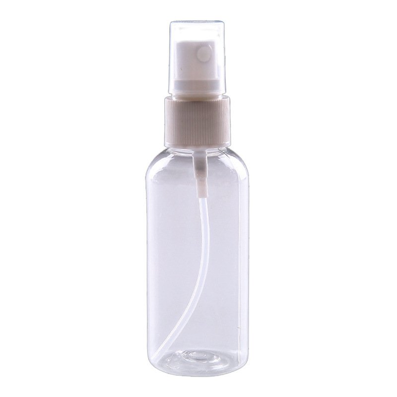
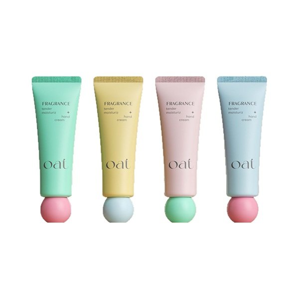
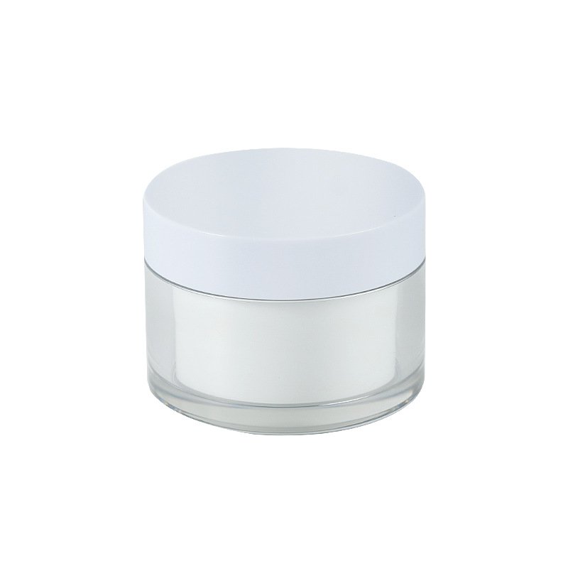
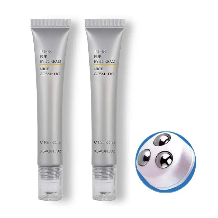
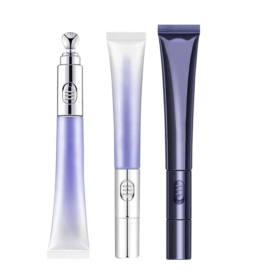
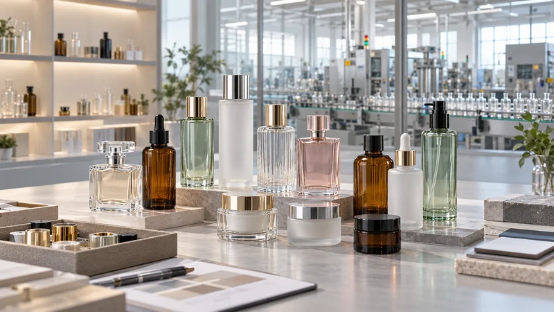
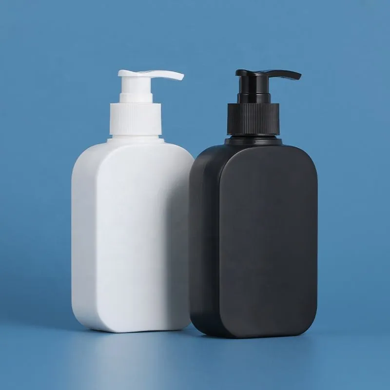
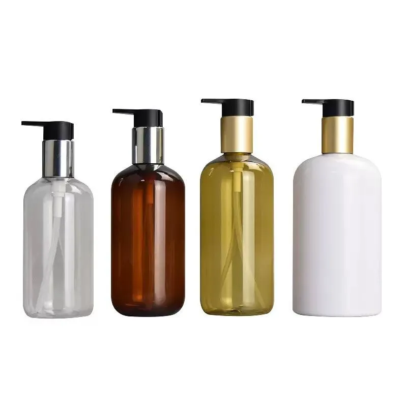
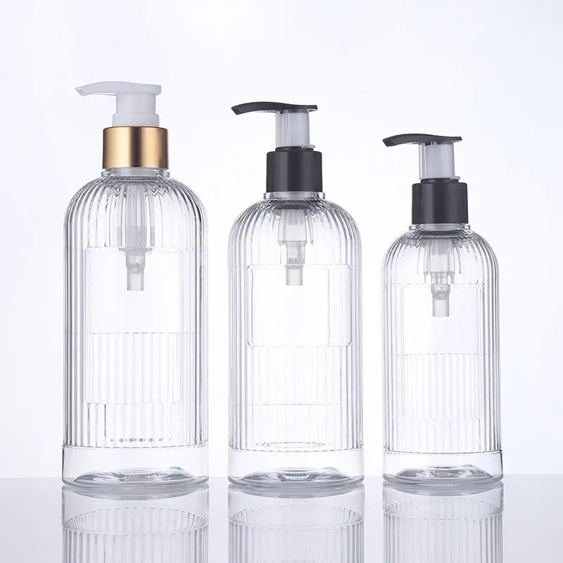
Direct answer: the same Pantone reference can look different on a cosmetic bottle and cap because Pantone communicates a colour target; it does not create one universal pigment recipe or identical appearance on every material. A glossy translucent PET bottle, an opaque matte PP cap and a spray-coated glass bottle reflect and transmit light differently. Resin base colour, wall thickness, mould texture, pigment dispersion, processing heat, coating thickness and viewing light add further variation. For a close assembled match, develop and approve a separate colour formulation for each material–process–finish combination, then control both instrumental colour and visual appearance under specified conditions.
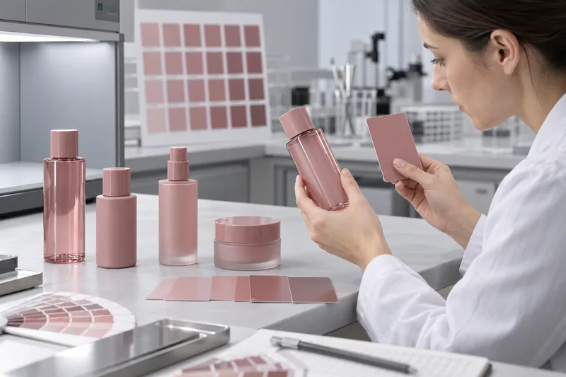
Why does the same Pantone look different on a bottle and cap?
Colour is not a pigment number alone; it is the visual result of light interacting with a complete object. The bottle and cap may differ in polymer, natural resin colour, opacity, thickness, shape, surface texture and manufacturing route. Those differences change which wavelengths are absorbed, scattered, transmitted and reflected toward the observer. The assembled product is therefore the final visual reference.
A common cosmetic package illustrates the problem. Its bottle may be stretch-blow-moulded transparent PET with a pink tint, while its cap is injection-moulded opaque PP. The bottle is viewed through two curved walls and sometimes through the filled formula. The cap is viewed mainly by surface reflection from a flat or textured opaque part. Even if both suppliers begin with the same Pantone code—or even the same nominal pigment—the consumer is not seeing the same optical system.
The correct target is usually assembled harmony
If the commercial goal is for the bottle and cap to look the same on shelf, each component may need a different pigment formula or coating build. Requiring the same masterbatch percentage across different resins can make the mismatch worse. Approve the assembled package as well as each separate component.
What does a Pantone colour specify?
A Pantone reference is a communication target within a named Pantone system. It is not a resin formulation, masterbatch dosing rate, coating recipe, gloss level, opacity requirement or automatic production tolerance. The supplier still has to formulate the colour for the actual resin, process and finish.
Identify the system and physical reference, not only a code in an email. A Pantone paper guide represents ink on a defined paper condition; a plastics chip is a more relevant starting reference for a plastic part. Pantone describes its plastic chips as physical standards intended to improve colour communication through plastics design and production. Neither form removes the need to approve actual production components.
| Reference supplied | What it can do | What it cannot prove |
|---|---|---|
| Pantone code only | Identifies an intended colour family when the Pantone system and guide are also clear. | Which physical guide/edition was viewed, its condition, substrate appearance, tolerance or formulation. |
| Physical Pantone chip/guide | Provides a tangible colour target under controlled viewing. | How a curved translucent bottle or matte cap will look; whether old guides have shifted. |
| Approved production component | Shows colour together with the actual material, geometry, wall, finish and process. | The allowable production variation unless measurement conditions and limits are documented. |
| Digital screen image or phone photo | Useful for communicating the location and nature of a suspected mismatch. | Reliable colour approval: screens, cameras, white balance, compression and ambient light alter appearance. |
Seven drivers of cosmetic packaging colour difference
1. Resin and substrate base colour
PET, HDPE, LDPE, PP, ABS, SAN, PETG, glass, aluminium and coated parts do not begin as identical colourless surfaces. Natural resin may be water-clear, bluish, milky or slightly yellow; additives and recycled content can shift the base. Pigments also disperse and interact differently with each polymer and processing temperature. For product selection, compare plastic cosmetic bottle materials and formats before assuming one colour recipe can transfer from bottle to closure.
2. Opacity, wall thickness and backing
Opaque parts are judged mainly by reflected light. Transparent and translucent parts also transmit light, so wall thickness, the background and whatever is behind the component affect the result. A coloured formula can deepen, mute or shift a tinted bottle; the air space above the fill may look different from the filled region. HunterLab’s guidance for translucent samples stresses that thickness must be selected, recorded and kept consistent during measurement.
For a clear or tinted bottle, define whether colour is measured in transmission, reflectance over a specified backing, or on a correlated plaque. Do not compare a cap measured directly with a bottle measured against an uncontrolled tabletop.
3. Gloss, texture and geometry
Glossy surfaces produce specular highlights; matte or textured surfaces scatter light. The same underlying colour can therefore appear darker, lighter, softer or less saturated. Curvature creates changing highlight and shadow zones, while ribs, embossing and mould texture make the viewing direction important. ASTM D523 treats specular gloss as a separate measurable appearance property. Colour and gloss should therefore be specified together when the assembled visual match matters.
4. Moulding and processing conditions
Colour development occurs within a manufacturing process. Masterbatch dosing, mixing, drying, melt temperature, shear, residence time, contamination, purging, cooling and regrind policy can change dispersion or degrade a resin, pigment or additive. Injection moulding a cap and blow moulding a bottle expose material to different thermal and flow histories. Stable colour requires a qualified process window, not only a correct pigment purchase order.
5. Coating and printing film build
Spray colour, UV coating and ink are films applied over a substrate. Their opacity, thickness, atomisation, overlap, flash-off and cure change the final colour and gloss. A translucent coating lets the bottle underneath contribute to the result. In printing, film thickness and substrate colour can be confounded; Datacolor notes that changes in transparent ink film thickness can look like changes in colour strength. For graphics, Boyu’s guide to silk-screen printing on bottles explains the linked controls for ink, surface, screen, fixture and cure.
6. Lighting and metamerism
Two samples can match under one illuminant and separate under another because their spectral reflectance curves differ. This is illuminant metamerism. CIE standard illuminant D65 represents a phase of average daylight at approximately 6,500 K, but actual retail LEDs, office lighting and warm home lighting can have different spectral distributions. ASTM D4086 provides a visual practice for evaluating metamerism.
Approve under a primary standard condition and assess the important secondary use environments. A package that passes under D65 but visibly separates under the brand’s retail lighting has a real commercial risk even if its primary measurement remains unchanged.
7. Measurement and sample-presentation differences
Different instruments, geometries, apertures, calibration status, illuminants, observers, specular settings, backing materials and measurement locations can produce non-comparable numbers. A curved bottle that does not cover the measurement port consistently may leak ambient light or be sampled at different wall zones. Measurement variation can be mistaken for production variation unless the method is locked.
The cosmetic packaging colour-development process
Reliable colour development is a controlled translation from brand intent to component-specific production recipes. The sequence below applies to moulded plastics, with appropriate changes for coated glass, metal and printed decoration.
- Define the assembled target. Identify which parts must match, which may intentionally contrast, the final formula colour, intended gloss/texture, retail lighting and the viewing relationship between adjacent components.
- Issue a controlled reference. State the Pantone system/code and supply a current physical reference. If a brand-owned master exists, identify its revision and priority over the Pantone starting reference.
- Create a component matrix. For every bottle, cap, pump collar, actuator, overcap and jar, record substrate/resin grade, recycled content, pigment route, moulding or coating process, finish, supplier and production site.
- Formulate by material and process. The colourant supplier or compounder selects pigments/dyes, carrier resin and loading compatible with the base material, heat history, opacity, regulatory/compliance brief and appearance target.
- Produce laboratory and tool trials. Plaques are useful for efficient formulation, but final approval should include production-intent parts from the real mould, wall section, texture and process. Curved bottles and textured caps can diverge from flat chips.
- Measure and correct directionally. Compare L*, a* and b* or L*, C* and h components—not only a single ΔE. The direction tells the formulator whether the sample is too light/dark, red/green or yellow/blue.
- Approve the assembled package. View bottle, cap, pump and decoration together under defined lights, both empty and filled when the formula changes appearance.
- Lock the production baseline. Record material and masterbatch suppliers/grades, formula code, dosing, process window, mould/cavities, finish, measurement method, numerical limits, visual masters and change-approval requirements.
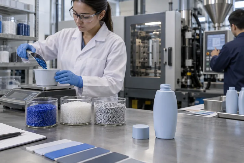
Moulded-in colour, spray coating or printing: which route matches best?
| Colour route | Strengths | Main colour-consistency risks | Best control |
|---|---|---|---|
| Moulded-in masterbatch or precoloured resin | Colour extends through the wall; no exterior film to chip; efficient for repeat production. | Base-resin/lot variation, dosing, dispersion, thickness, crystallinity, heat history and cavity gloss. | Material-specific formulation, gravimetric dosing where appropriate, controlled process and actual-part measurement. |
| Spray-coated glass or plastic | Can mask substrate variation and coordinate dissimilar materials; broad matte/gloss/effect options. | Film thickness, edge/shoulder coverage, overspray, batch mixing, flash-off, cure, adhesion and chemical resistance. | Coating specification, application/cure window, colour plus gloss measurement, adhesion and formula-contact validation. |
| Screen/offset/UV printing | Precise logos and graphics; spot colours can extend the brand system. | Ink opacity, substrate show-through, screen/plate, viscosity, cure and overprint sequence. | Approved ink/substrate/process combination, film-build control and adhesion/abrasion/chemical testing. |
| Metallic, pearlescent, metallised or anodised effect | Creates directional sparkle, flop and premium appearance not available from flat colour alone. | Appearance changes strongly with angle, particle orientation, substrate smoothness and film build. | Multi-angle visual/instrumental assessment and effect-specific limit samples; do not rely on one flat ΔE reading. |
Coating is not automatically “more accurate,” and moulded colour is not automatically “more consistent.” Choose the route that can meet the complete appearance, durability, compatibility, recyclability and commercial brief. If colour is applied to glass, review cosmetic glass packaging formats using the final frosting, coating and decoration stack—not bare glass alone.
How should cosmetic packaging colour be measured?
CIELAB describes colour with three coordinates: L* for lightness, a* along the red–green axis and b* along the yellow–blue axis. A colour-difference formula combines differences into a value such as ΔE*ab or CIEDE2000 (ΔE00). ISO/CIE 11664-6 defines the CIEDE2000 formula; ASTM D2244 covers calculations and stresses that results from different colour-difference systems are not interchangeable by a simple universal factor.
A reproducible method must define all of these
- Reference: approved physical master or stored spectral data, unique ID, revision and condition.
- Instrument and geometry: instrument class/model or agreed equivalence, measurement geometry, calibration and inter-instrument alignment plan.
- Illuminant and observer: for example D65 and a stated CIE standard observer; do not exchange Lab numbers without these conditions.
- Specular condition: SCI/SPIN or SCE/SPEX. X-Rite defines SCI as including total diffuse and specular reflectance, while SCE excludes specular reflection. Use the same mode for standard and batch.
- Difference formula: ΔE*ab, CIEDE2000, CMC or another agreed system, including any parametric factors. “ΔE 2” is incomplete without the formula and method.
- Sample presentation: component state, conditioning, backing, thickness, filled/empty condition, aperture, measurement zone, orientation and fixture.
- Replicates: number and location of readings, rotation/repositioning and how the average and individual result are handled.
- Separate appearance measures: gloss, haze or effect/multi-angle data when these influence acceptance.
- Visual review: light-booth sources, surrounding colour, observer training, viewing distance/angle and assembled configuration.
ASTM E1164 addresses instrument parameters, calibration, standards and specimen selection for precise spectral data. ASTM E1345 provides a statistical approach for using multiple measurements to reduce measurement variability. These standards are useful foundations, but the packaging specification must still define how a particular curved, translucent or textured component is presented.
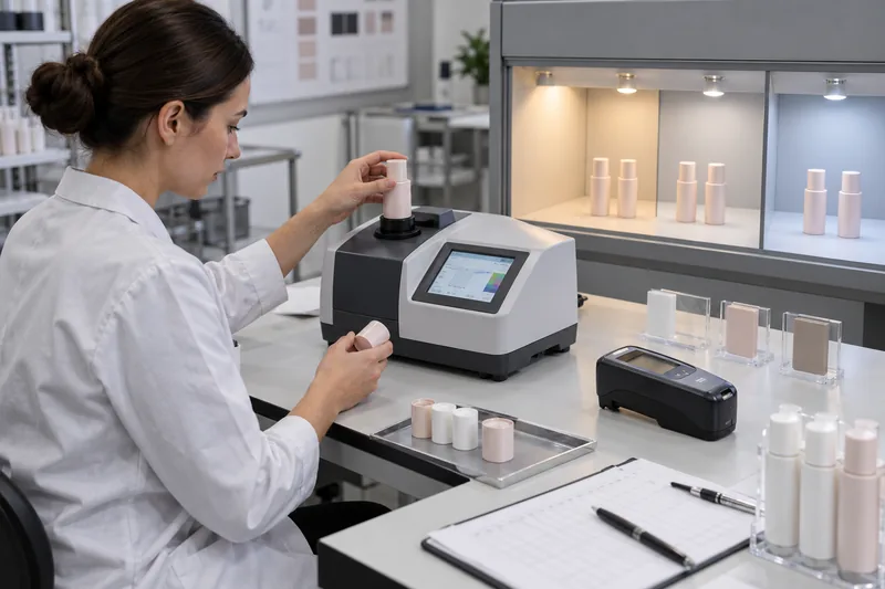
A colour plaque cannot replace the finished part
A flat plaque is useful for formulating and checking the intrinsic colour of a material because it offers controlled thickness and a stable measurement surface. The commercial bottle can still look different because stretching, crystallinity, wall distribution, curvature, mould polish and texture change its optical appearance. Use a plaque for material/process control only after demonstrating how its result correlates with the production component. When the actual bottle is too curved or small for repeatable direct measurement, define a controlled measurement zone or companion plaque made from the same qualified material and process, then retain visual approval of the assembled pack as a separate gate. Never silently substitute plaque data for a component specification.
What ΔE tolerance should cosmetic packaging use?
There is no universal ΔE limit for every cosmetic bottle and cap. ASTM D2244 states that purchaser and seller should agree on the permissible tolerance and calculation procedure; it also notes that material, proximity, gloss and texture can change how a measured difference relates to commercial acceptability. A tolerance copied from a supplier website is therefore not a complete specification.
Set the acceptance window by correlating controlled visual judgments with instrumental data from the real package. Consider how closely parts sit together, whether the colour is a critical brand signature, whether the surface is opaque or translucent, the process capability, repeat-order needs and the consequence of rejecting good parts or accepting visible mismatch.
Do not rely on total ΔE alone
Two batches can have the same total colour-difference magnitude but move in visually different directions. Record directional components or equivalent lightness/chroma/hue information. For a warm beige package, a small green shift may be more objectionable than a similar lightness shift. Component-specific limits can therefore be more useful than one spherical “pass” boundary.
Use two acceptance levels
- Component conformance: each bottle and cap meets its approved material/process master under the written measurement method.
- Assembled appearance: the complete package falls within approved visual limit samples under primary and secondary lighting, including gloss/texture and formula effects.
This resolves a frequent dispute: a bottle and cap can each pass against separate standards yet look mismatched together if those standards were not coordinated. Conversely, dissimilar materials may look harmonious while their measured Lab coordinates differ because the measurement includes different surface effects.
Common colour problems, likely causes and corrections
| Observed problem | Most useful first distinction | Likely causes | Corrective direction |
|---|---|---|---|
| Bottle and cap differ from the first sample | Does each part pass its own approved master, or were both compared only with Pantone? | Uncoordinated masters, different resin/process/finish, wrong reference or supplier formulated independently. | Create component-specific production masters and approve the assembled pack; adjust recipes separately. |
| Batch is uniformly too light/dark or red/green/yellow/blue | Review ΔL*, Δa* and Δb* direction against the same method. | Wrong dosing, base-resin lot, colourant lot/formulation, coating mix or process shift. | Quarantine; verify materials and dosing; correct using a controlled trial rather than an undocumented shop-floor addition. |
| Streaks, specks or swirls | Is the defect random, flow-oriented or tied to colour changeover? | Poor dispersion/mixing, incompatible carrier, contamination, incomplete purge, agglomerate, moisture or excessive regrind. | Check masterbatch/resin compatibility, drying, feeder/mixer, screw condition and purge; do not average defective areas into one colour reading. |
| Variation between mould cavities | Track colour and gloss by cavity and fixed measurement zone. | Cavity texture/polish, cooling, flow, wall thickness, venting or local process imbalance. | Separate material colour from surface/gloss; correct tool or process imbalance and include cavity sampling in release. |
| Matches in daylight booth but fails in store | Compare under the actual retail spectral environment and another relevant source. | Metameric pigment systems or effect finish. | Reformulate toward lower metamerism where feasible or define an accepted secondary-light limit. |
| Empty bottle passes; filled bottle looks wrong | Does the effect follow fill level or develop with ageing? | Formula seen through translucent wall, changed backing/optical path, migration, coating attack or formula discolouration. | Approve filled appearance and run cosmetic packaging compatibility testing; investigate formula change separately. |
| Colour changes during storage or light exposure | Compare dark/light, filled/empty and retained component/formula controls. | Pigment/dye or resin degradation, insufficient lightfastness, heat, oxidation, formula interaction or coating yellowing. | Stop release if outside specification; identify whether packaging or formula changed using Boyu’s formula-discolouration investigation. |
A five-step root-cause sequence
- Quarantine and preserve evidence. Record part, lot, cavity, time, machine, material/masterbatch/coating batches, process settings, fill state and lighting.
- Confirm the comparison. Verify the approved master, instrument calibration, method, backing, measurement zone and sample conditioning before changing production.
- Separate colour from appearance. Compare SCI and/or SCE as specified, measure gloss separately, and inspect texture, film thickness, opacity and geometry.
- Run controlled crossovers. Use known-good resin/masterbatch or coating with the current process, and suspect material under a known-good condition where feasible. Change one factor at a time.
- Verify the correction across normal variation. Include cavities, start/middle/end of run, relevant lots and assembled viewing—not one hand-selected part.
How to keep colour consistent from batch to batch
Repeatability depends on freezing the complete approved system and managing change. A purchase order that says only “Pantone 7606 C” leaves unresolved the resin, masterbatch, carrier, dosing, opacity, process, finish, gloss, measurement method and tolerance.
- Approve and identify the exact base resin grade, colour masterbatch/precolour formulation, additives, recycled-content source and permitted regrind policy.
- Use controlled dosing and mixing equipment appropriate to the process; calibrate feeders and record actual settings.
- Control drying, melt/oven temperature, residence time, speed, pressure, cooling, coating viscosity/solids, spray parameters and cure within qualified limits.
- Purge equipment adequately between colours; prevent contamination from previous pigment, dust, oil and cleaning materials.
- Approve by lot and mould cavity where variation warrants it; examine start-up, stable production and end-of-run samples.
- Trend L*, a*, b*, ΔE and gloss instead of recording only pass/fail. A stable drift toward a limit is actionable before rejection occurs.
- Require prior review for resin, masterbatch/pigment, PCR source/content, coating/ink, mould texture, tool/cavity, process, subcontractor or manufacturing-site changes.
Recycled resin can add feedstock colour and lot variability that requires a different control strategy from virgin clear resin. Do not promise an unchanged bright pastel or transparent tint after adding PCR without production data. Treat recycled content, masterbatch and opacity as one formulation problem, then verify the resulting pack’s performance and appearance.
How should golden samples and limit samples be used?
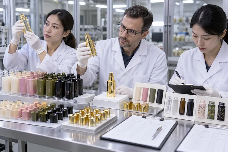
A golden sample is the approved target component or assembly. Limit samples show the boundaries of acceptable appearance—for example, the light/dark or red/green extremes that remain commercially acceptable. They are useful because a numerical total can miss a disliked directional shift, texture difference or coating pattern.
Control physical samples like documents
- Give each sample a part number, colour/finish code, revision, supplier/site, approval date and authorised signatures.
- State whether it controls colour, gloss, texture, coating distribution, assembly appearance or all of these.
- Store protected from light, heat, dirt, scratching and chemical exposure; use handling covers where practical.
- Keep matched copies at the brand, component supplier, decorator and assembler/filler; verify copies against one master.
- Define replacement/reverification intervals based on material stability and handling. A faded or yellowed master creates systematic drift.
- Connect the sample ID to spectral data and the written measurement method; neither physical sample nor numbers should exist without the other.
Include colour and decoration controls in the broader cosmetic bottle quality test plan. Colour approval does not prove coating adhesion, abrasion resistance, compatibility, lightfastness or distribution durability.
What should a cosmetic packaging colour specification include?
- Component name, part number/revision, supplier, manufacturing site, mould/tool and cavity identification.
- Substrate or exact resin grade, virgin/PCR content and source controls, additives and approved colourant/coating/ink route.
- Pantone system/code and physical-reference priority; brand master and golden/limit-sample IDs.
- Opacity or translucency requirement, wall/film thickness relevant to colour, surface texture and separate gloss limits.
- Instrument, geometry, aperture, calibration, illuminant, observer, SCI/SCE, difference formula and parametric factors.
- Measurement location, fixture, backing, thickness, filled/empty state, orientation, number of readings and averaging rule.
- Numerical total and directional limits, treatment of individual versus average readings, and visual acceptance under named light sources.
- Sampling across lots/cavities and production stages, retain samples, data reporting and trend-review requirements.
- Durability checks for light, heat, formula contact, abrasion, adhesion and distribution as the decoration and market require.
- Change-notification and reapproval triggers for material, colourant, PCR, coating/ink, tool, site, subcontractor or process changes.
Send suppliers the assembled visual objective, not separate colour codes without context. For a project-specific review, contact Boyu Packaging with the bottle and closure materials, Pantone system/reference, finish, formula colour, target markets, annual/repeat-order needs and any current colour data.
Frequently asked questions
Can the bottle and cap use the same colour masterbatch?
Only if the masterbatch carrier, pigments and processing are compatible with both resins and the resulting parts meet the approved appearance. PET bottle and PP cap systems commonly need different formulations. Using the same concentrate or percentage does not guarantee a visual match and can create processing or performance risks.
Can a plastic bottle match a Pantone colour exactly?
It can be formulated to an agreed visual and instrumental tolerance, but “exact” is incomplete without a physical reference, material, finish, measurement method and allowable variation. Transparent, metallic, pearlescent and highly textured parts may require effect-specific approval beyond a conventional opaque Pantone comparison.
Can colour samples be approved from photographs?
Photographs can document the type and location of a problem, but they are not reliable final colour standards. Camera processing, white balance, lighting, file compression and displays alter colour. Approve physical samples or agreed spectral data under controlled conditions.
Should colour be approved before or after filling?
Approve both when the bottle is transparent or translucent or when formula exposure could change the pack. The empty component is needed for manufacturing control; the filled assembly represents the product consumers see and belongs in compatibility/stability evaluation.
Does PCR make colour matching harder?
It can. PCR may have a non-neutral feedstock colour and greater lot variability than a controlled virgin grade. The practical effect depends on polymer, PCR source/content, sorting/processing, target colour and opacity. Develop and approve the colour in the exact PCR construction rather than transferring a virgin-resin recipe.
What should we do with an off-colour production lot?
Quarantine it, preserve traceability and confirm the reference/measurement method before making adjustments. Determine whether the issue is true substrate colour, gloss/texture, coating thickness, metamerism, formula effect or measurement error. Accept a deviation only through authorised review against the assembled-pack risk; do not blend or recolour without a validated rework route.
Sources and technical references
Accessed 2 October 2026. Standards must be purchased or consulted in their complete current editions before being written into a contract or laboratory procedure.
- Pantone — Pantone Plastics Standards Explained
- CIE — ISO/CIE 11664-6:2022, CIEDE2000 Colour-Difference Formula
- CIE — ISO/CIE 11664-2:2022, Standard Illuminants
- ASTM International — ASTM D2244-25, Calculation of Color Tolerances and Color Differences
- ASTM International — ASTM D1729-22, Visual Appraisal of Colors and Color Differences
- ASTM International — ASTM D4086-18(2023), Visual Evaluation of Metamerism
- ASTM International — ASTM D523-25, Specular Gloss
- ASTM International — ASTM E1164-23, Spectrometric Data for Object-Color Evaluation
- ASTM International — ASTM E1345-24, Multiple Color Measurements
- HunterLab — Color Measurement of Translucent Samples
- Datacolor — Best Practices for Measuring Color Samples
- X-Rite — Color Technology Glossary, including SCI and SCE
- X-Rite — Why Use Daylight in a Light Booth?

 English
  Español de Argentina
  Русский
  Italiano
  日本語
日本語  한국어
한국어  العربية
  Français
  Deutsch